v6 feature Admin Content
1.1. Designer tab
A drag-and-drop designer allows you to customise your forms to your requirements by simply dragging and dropping different user interface element icons onto your editor. These elements can include questions, images, text, option buttons, check boxes, toggle buttons, file uploads, panels and much more. You can hover over icons appearing on the far left to see what it adds to the form.
1.1.1. How to Design a Form
The first step to creating a form is to design the look and feel of the form. The title of the form, company logo, page dimensions, navigation, etc., can be configured using the procedure mentioned below. Before you start creating a form, you must add a title to the form. You can include an image, such as the company logo, and a brief description of the form in the title. There are many display, navigation, and validation settings you can configure for the form.
In the Designer tab, you can configure any of the following form-level properties using the right-side list. Each of these form-level properties identified in the image is further detailed in the table below.
.png)
Panel (in the Property Grid)
What the Panel is for
General
You can configure some form-level settings, such as the header, title, description, display mode, page width, etc.
Logo in the Form header
You can add and configure the display of your company logo in the form header.
Navigation
You can configure the navigation controls in a form such as the Next and Previous buttons, display of table of contents, progress bar, etc.
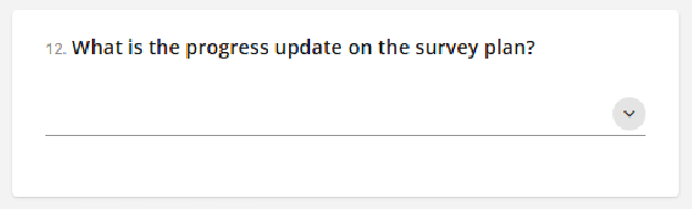
Question Settings
You can format the display properties of questions, such as the numbering, limit restrictions, alignment of questions and answers, marking mandatory questions, and the display of error messages.
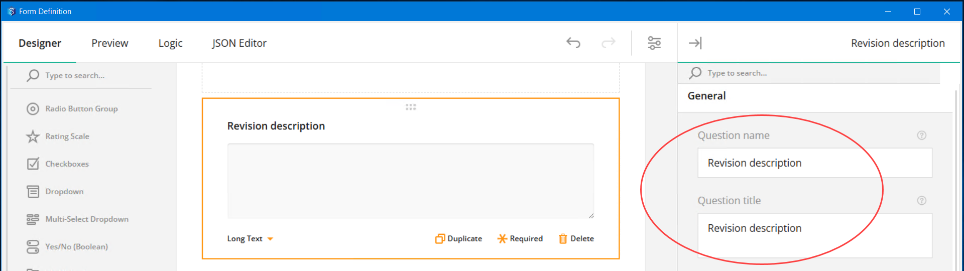
It is strongly recommended that the question name and the question title are the same (except that the question name cannot include special characters). This makes it easy to define logic/conditions as the question name appears in the Select lists.
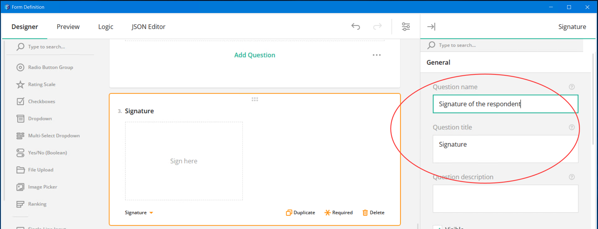
The name of a question CANNOT match the name of the question type/tool you are defining. However, the title can match the question type/tool you are defining. For instance, if you are using a Signature tool to capture the signature of the respondent, you can have Signature as the question title but NOT as the question name.
Pages
You can configure the display of page numbers and page titles.
Conditions
You can add conditions for the display of the form element for which this panel is selected.
Data
You can configure the display of answers on a page.
Validation
You can configure when the validation of answers has to happen.
Click the
 mark displayed against a field to understand what the field is for.
 In the Designer tab, you can create the content of the form using the left-side toolbar.
Click or drag and drop the required tool from the toolbar.
The corresponding element is added to the form.Configure the properties of the element using the panels displayed in the property grid. Ensure that the tool is selected when configuring its properties. The following table details all the available tools.
Tool | UI Element added | Preview | Properties |
|---|---|---|---|
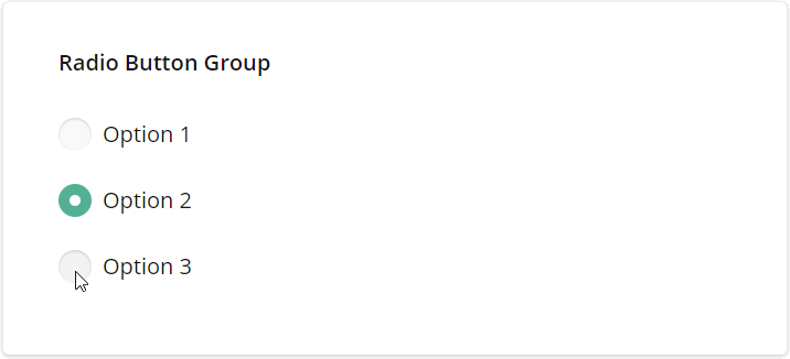
| Radio button group |
You can use the radio buttons for questions that have multiple options but accept only one answer. |
|
| Rating Scale |
You can use the rating scale type for questions that accept one rating value within a provided range. The design for the rating range can be displayed as stars, numbers or smileys. | |
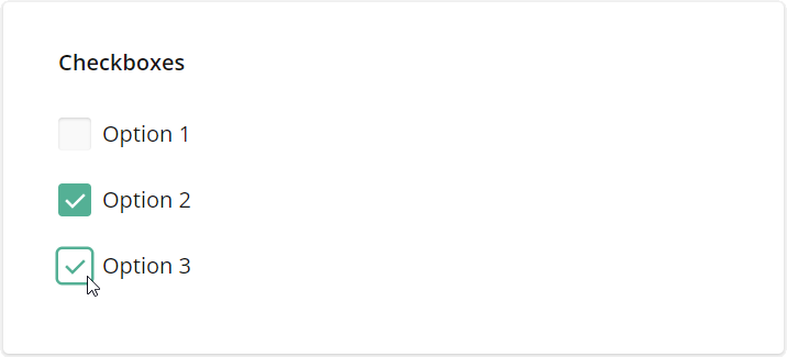
| Check boxes |
You can use checkboxes for questions with multiple options and multiple possible answers. | |
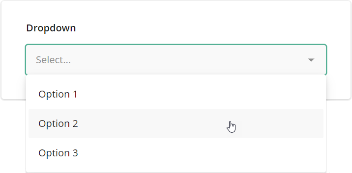
| Dropdown |
You can use the dropdown tool for questions that have multiple dropdown options (in a list) but accept only one answer. | |
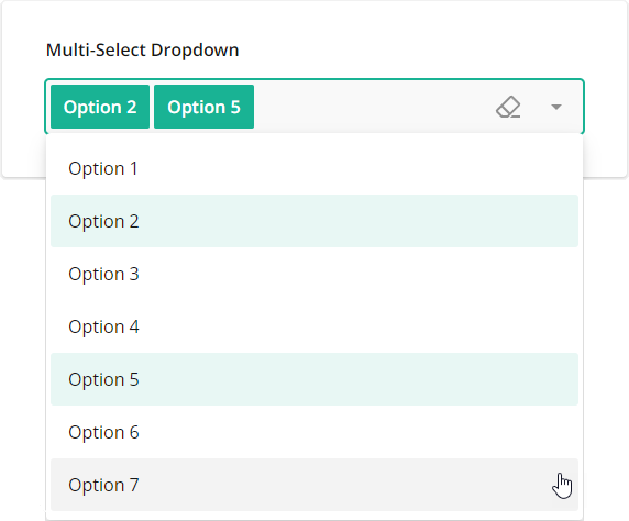
| Multi-select dropdown |
You can use the multi-select dropdown tool for questions with multiple dropdown options (in a list) that accept more than one answer. | |
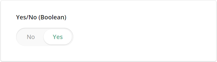
| Yes/No (Boolean) |
You can use the Boolean editor for questions that can have either a Yes or a No for an answer. | |
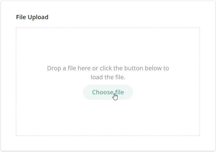
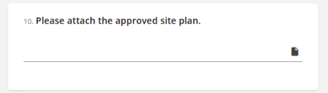
| File Upload |
You can use the File Upload tool to prompt the filler to upload files. The form filler can choose to either drag and drop the files or use the button provided to select the files. | |
| Image picker |
You can use the Image Picker tool to prompt the form filler to select one or several images based on the requirement that you configure. | |
| Ranking |
The ranking tool prompts the filler to drag and drop items from a list to rearrange and rank them according to preference or choice. | |
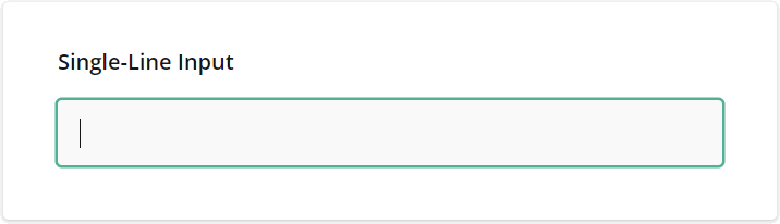
| Single-line Input |
You can use the Single-Line Input tool for questions that require short answers. You can specify the type of answer to be entered, such as text, numerals, date, time, etc. | |
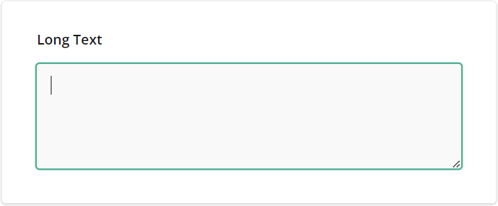
| Long Text |
You can use the Long Text for open-ended questions that accept multi-line answers. | |
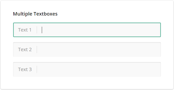
| Multiple Textboxes |
You can use the Multiple Textboxes for open-ended questions that require more than one short answer that can be entered in multiple single-line text prompts. | |
| Panel | You can use the Panel to group multiple questions that can be controlled together. | |
| Subform |
You can use the Subform Panel to create a template panel that contains multiple questions. While responding to the form, the form filler can add multiple template panels which serve as multi responses. | |
| Single-select Matrix |
| |
| Multi-select Matrix | You can use the Multi-Select Matrix to create a matrix of different question types. Each cell has to be answered in the matrix. | |
| Dynamic Matrix | The Dynamic Matrix is similar to a Multi-Select Matrix, just that you or the form filler can add and remove rows in the matrix. Note that all the columns of a row have to be answered. | |
| HTML | You can use the HTML type to format text as needed, include links, and insert media or other custom elements into the survey. This type is used for presentation only and does not produce a value to be saved in the survey results. | |
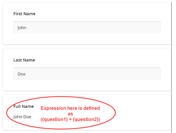
| Expression (read-only) | You can use this tool to to calculate values and present them to respondents as read-only content. For example, you can concatenate the first and last names to display a full name as shown in the example below. | |
| Image | You can use the Image tool to add an image or video to the form. Note that this is used only for display purposes. It is not a question for which a response is required. | |
| Signature |
|


.png)


.png "fileupload(1).png")

.png)

.png)
.png "singleline input(1).png")


.png "panel(1).png")

.png)

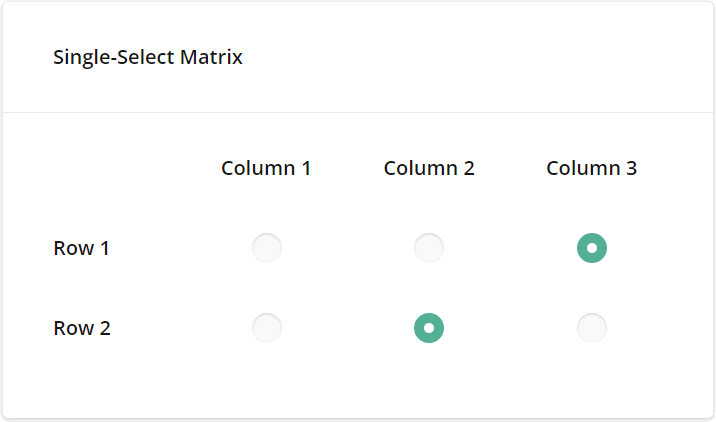 You can use the Single-Select Matrix to create column-wise answer options for row-wise questions, i.e., you can select one radio button in each row (for each question).

.png "html(1).png")

.png "image(16).png")
.png "signature(1).png")
.png)
Additionally, there are some customised attribute pickers that help you select 12d Synergy attributes and entities while answering and submitting the forms.
A form which includes any of the below-mentioned 12d Synergy attribute pickers CANNOT be filled out by an anonymous user.
Tool
UI Element added
Preview
Properties of tools

Company Picker
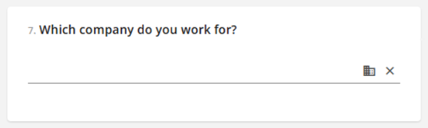
These tools enable you to select attributes and entities from the available corresponding information on your 12d Synergy Server. For instance, a Company Picker enables you to pick a company from the list of companies available in your 12d Synergy server.
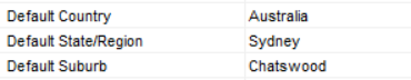
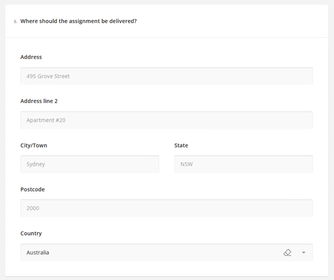
Address Picker
Your 12d Synergy Administrator can set the default City/Town, State, Country details by configuring the following settings in the 12d Synergy Administration application > System Settings tab.

Contact Picker
.png)

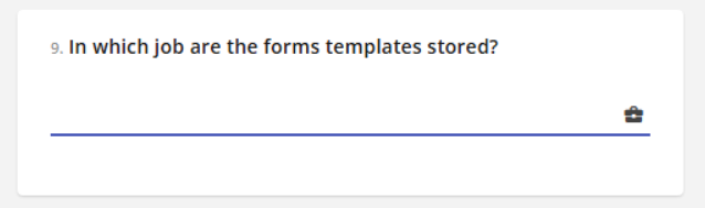
Job Picker

List Attribute Picker
.png)
Synergy File Picker
.png)
Location Picker
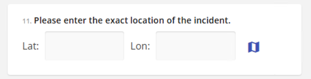

Address Picker
1.2 Preview tab
You can preview the display and working of the customised form in this tab. All the elements of the form can be updated and tested to meet your requirements. You can also see how your form looks on different devices using the  icon.
icon.
.png)